Brand Identity System · Period Care
Flow
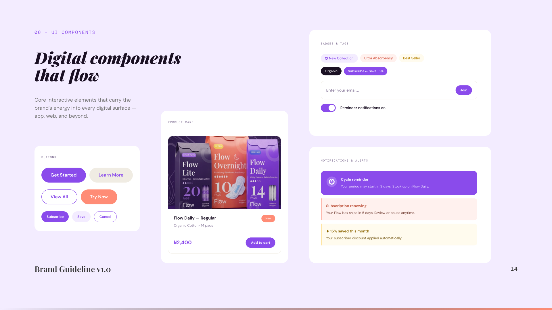
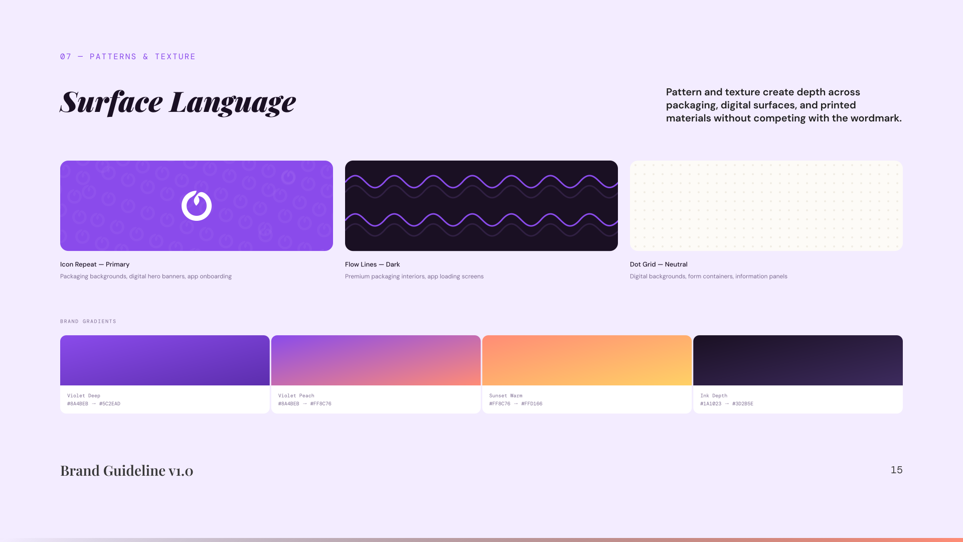
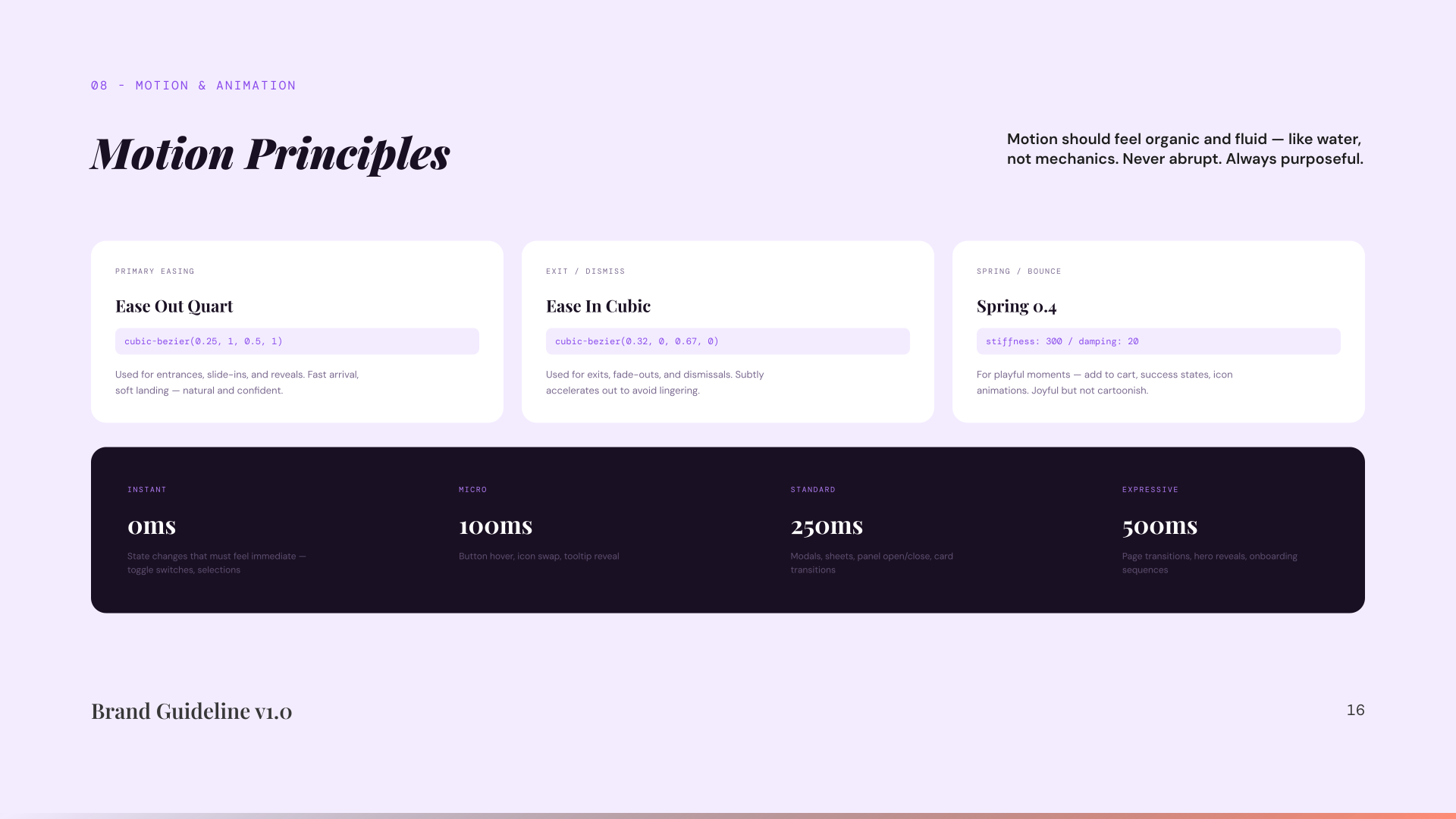
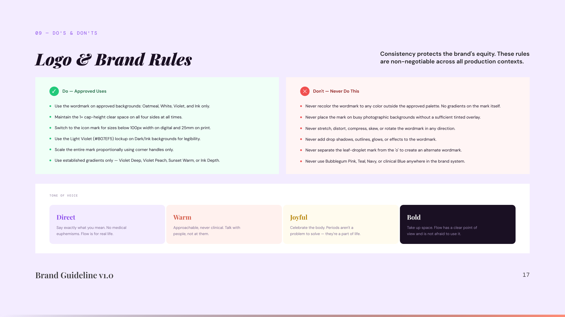
A complete brand identity system for a modern period care brand: built on vibrant colour, warm personality, and dignified design.
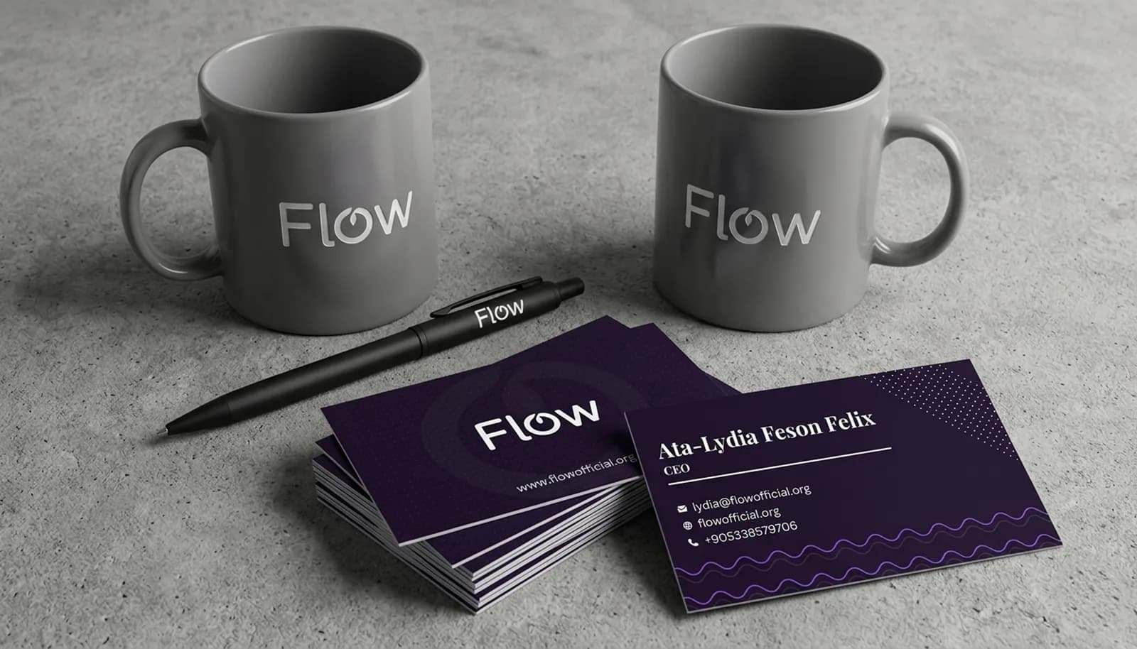
The problem
Period care branding defaults to clinical blue that signals illness or bubblegum pink that signals shame. Flow needed a system that read as dignified and genuinely joyful without either script.
The outcome
18section brand guideline, ready for handoff
4surfaces covered: print, packaging, app, motion
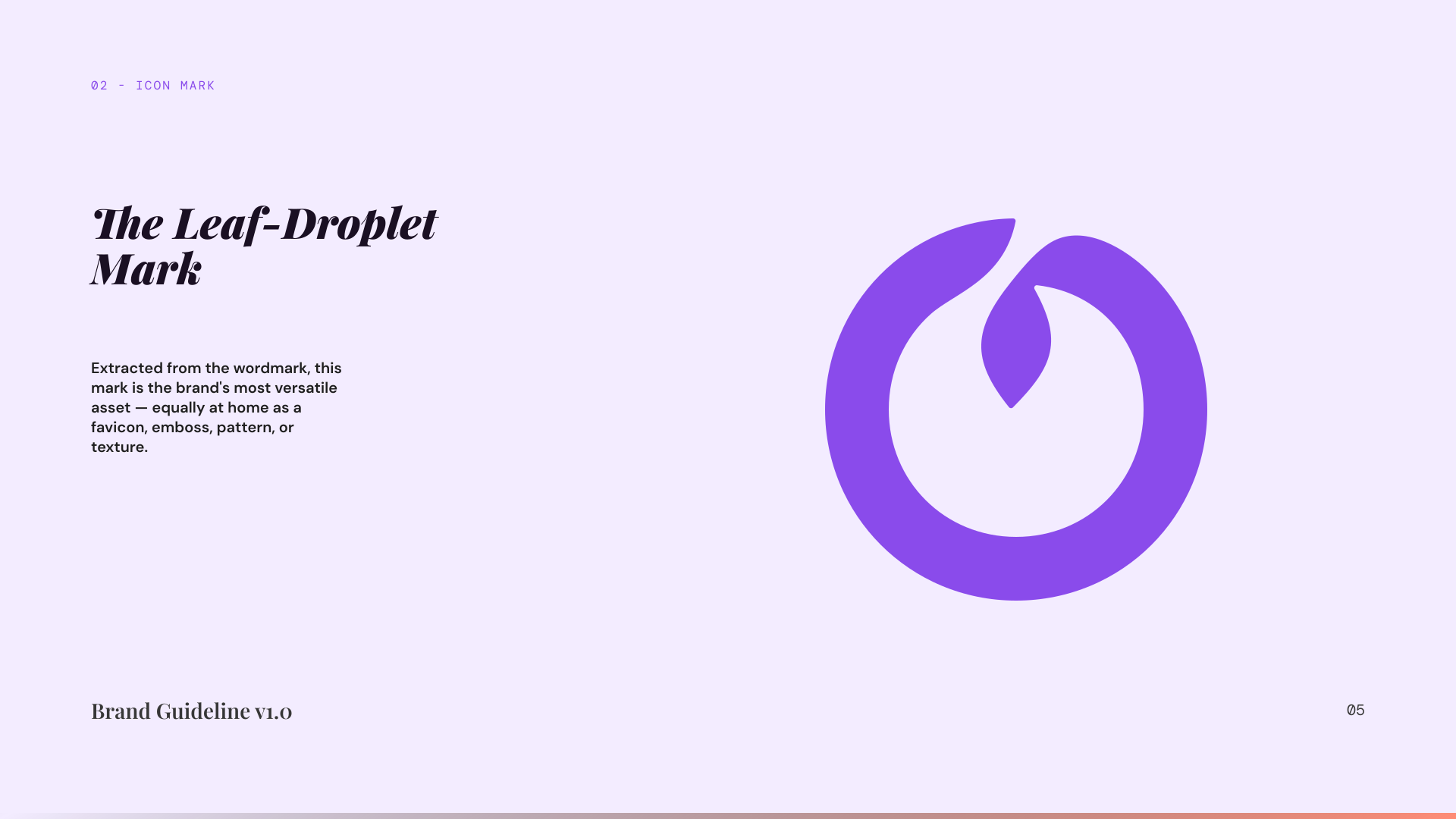
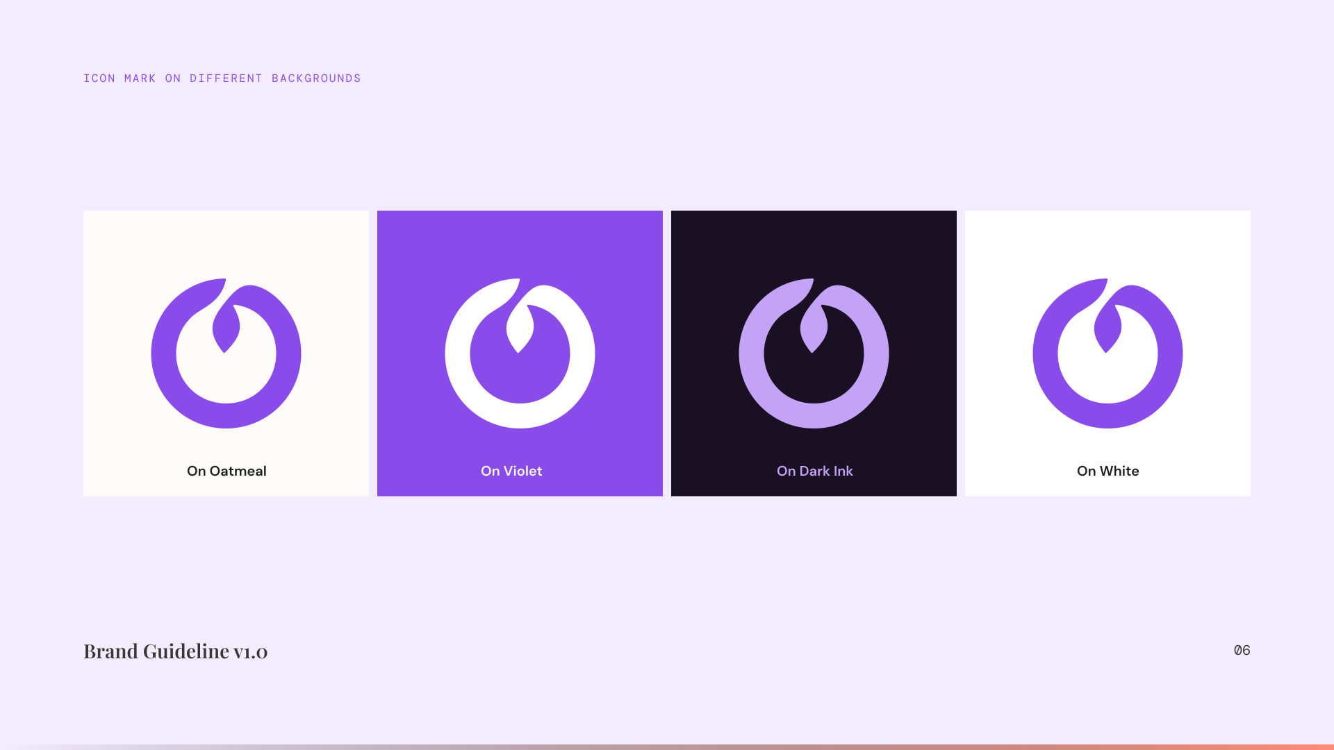
1mark that holds from a full box to a single wrapper
IdentityRead the design essay →
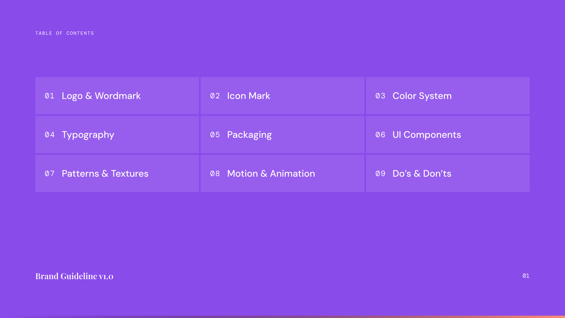
02: The Identity
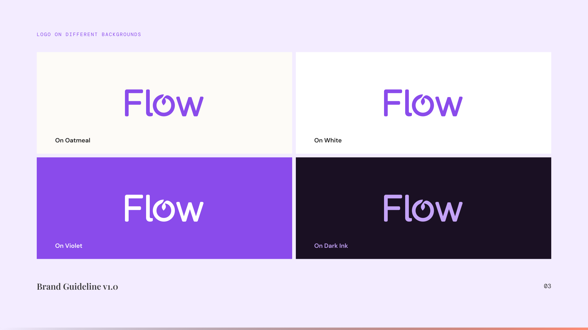
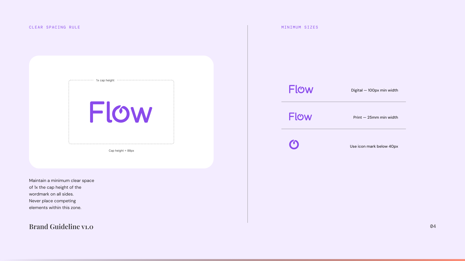
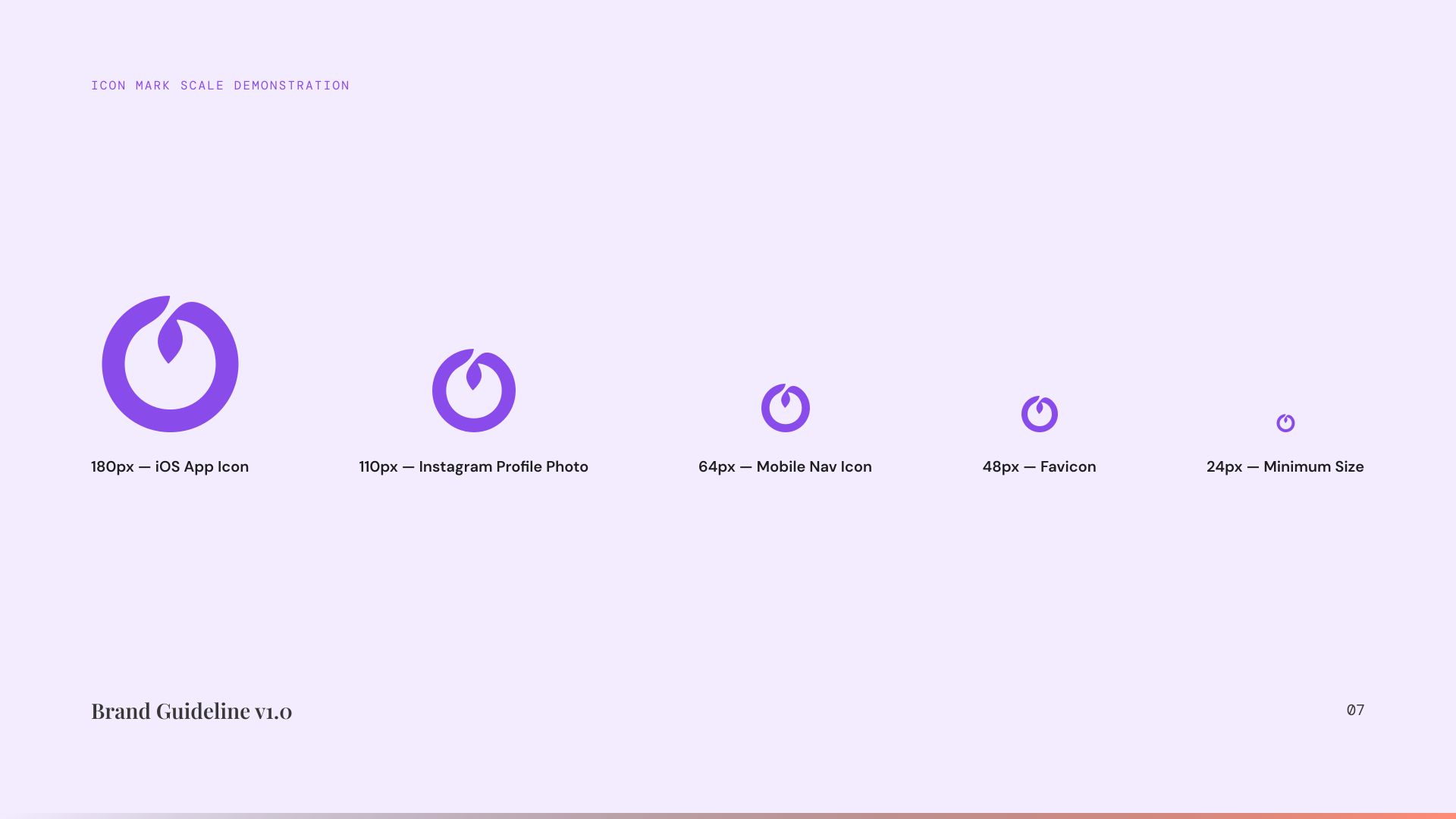
A mark that speaks plainly.
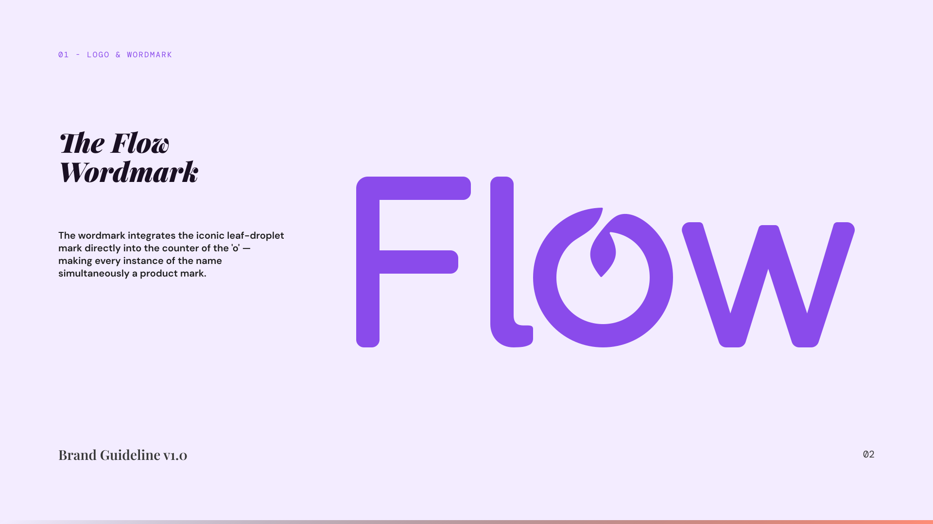
03: Colour & Type
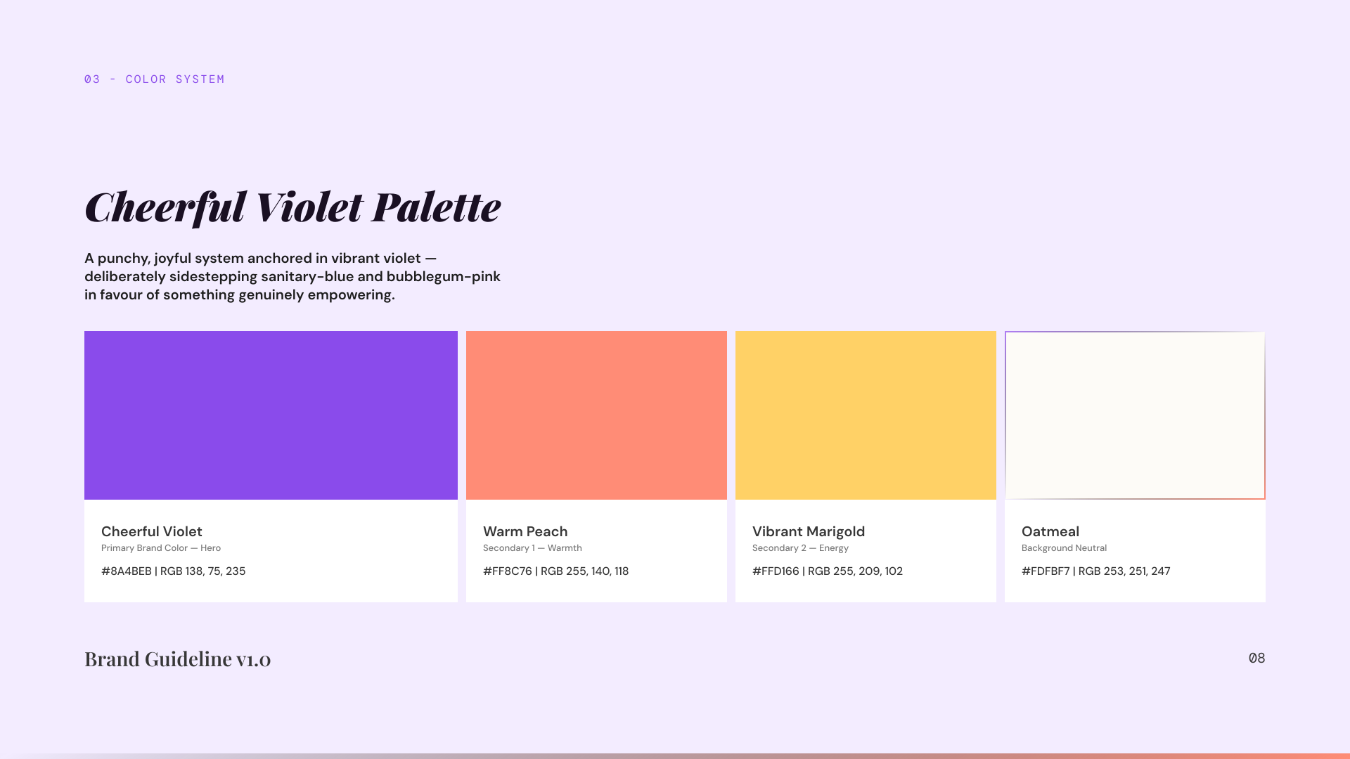
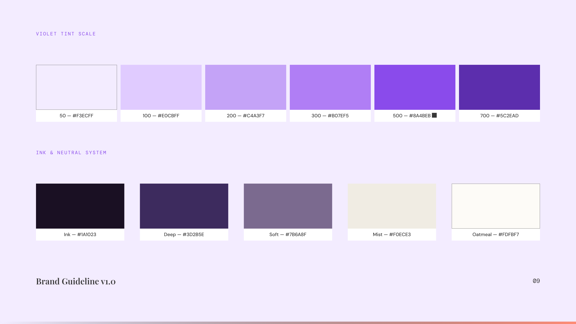
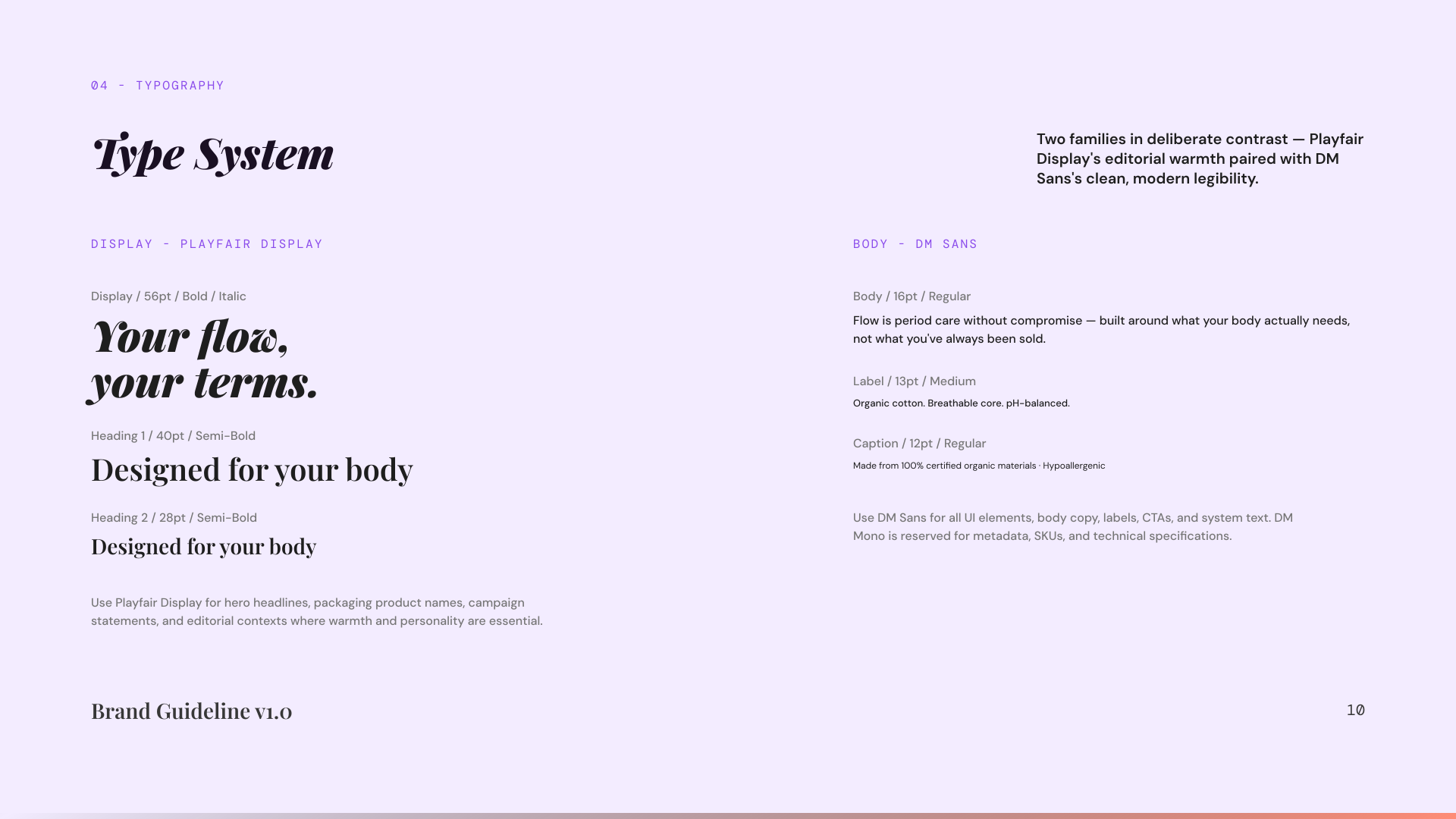
Colour does the emotional work.
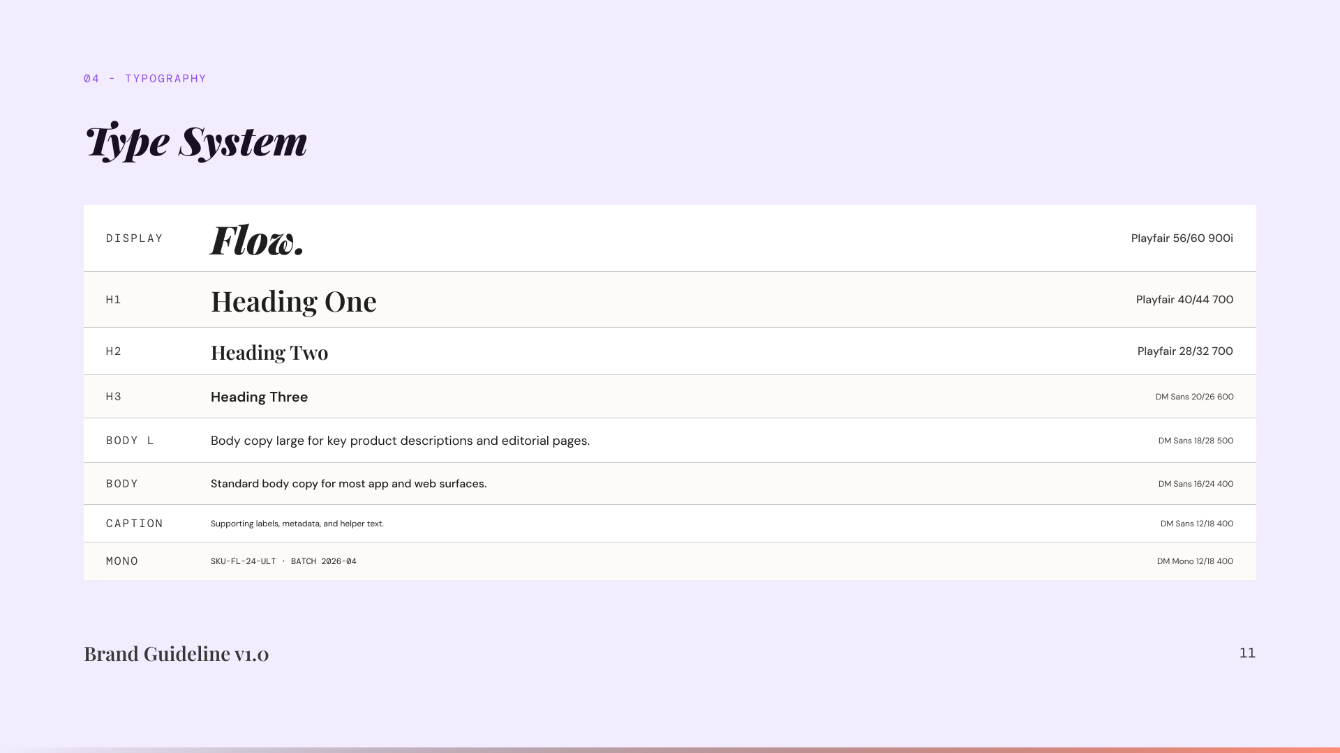
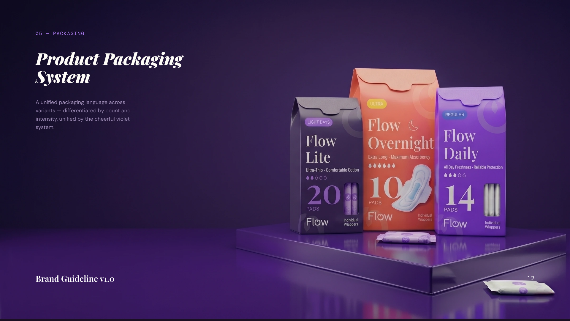
04: Packaging
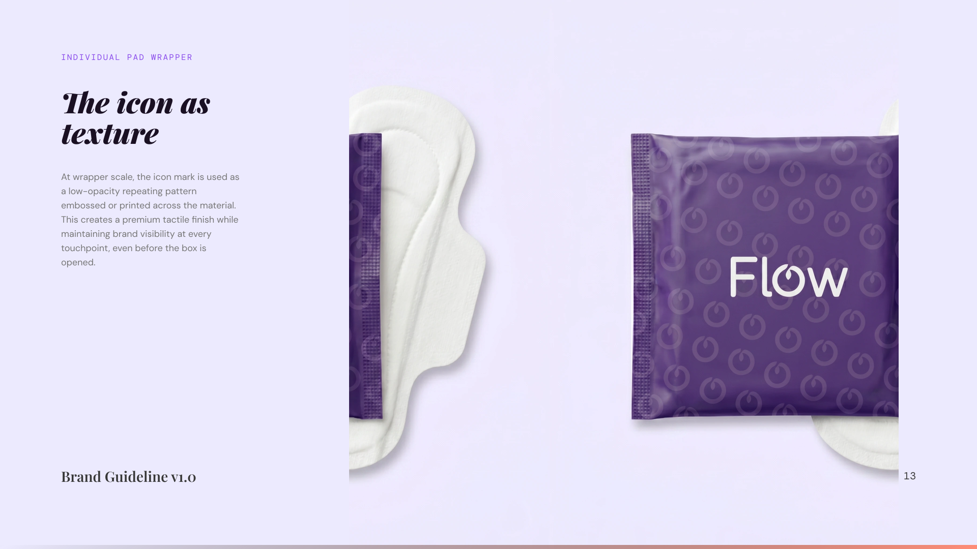
The most personal surface.
05: The System in Use
A living system, not a logo.